“A Year Later: Reviewing My Design Concepts a Year after Publication”
William Harris
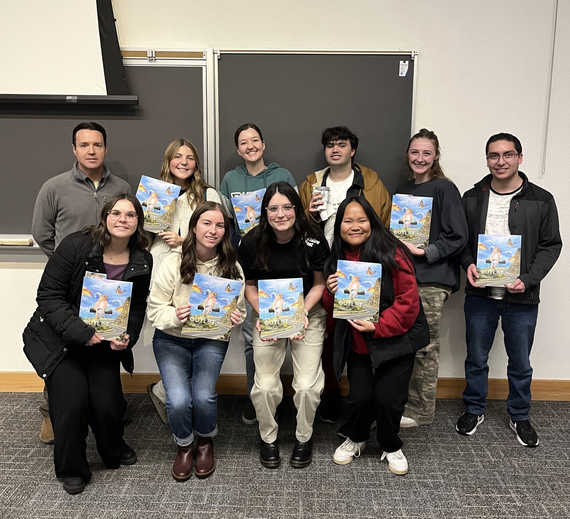
For this assignment, I went back and took a look at my concepts for the Outlet Magazine. This magazine was completly created and published by a graphic design class that I was in last year!!
I designed 5 seperate pieces, one of which was selected for publication.
Let’s take a look at that one, and use it to break down how the design process worked.
(see below for a preview of some early drafts)
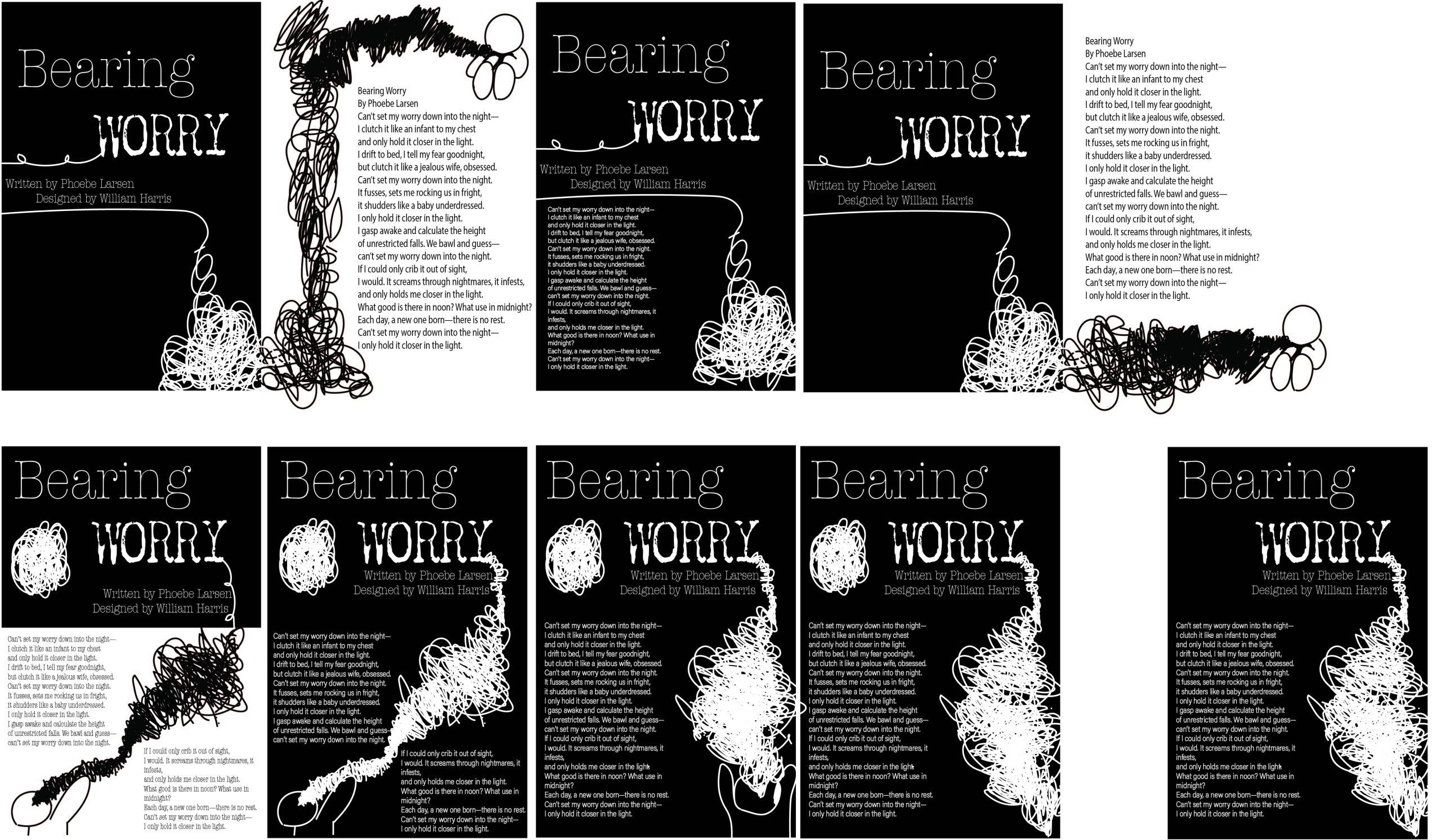
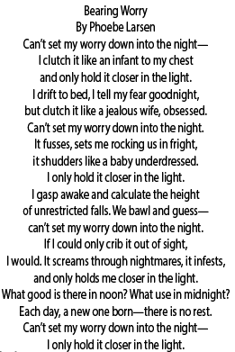
Here's my process for my piece that was selected for publication:
Bearing Worry!
The First Key for Designing for Articles/Poems is that everything comes from the text!!
Concept Overview
The poem was about becoming attached to your anxiety, and holding on to it even when it is unhealthy for you. I found the descriptions in the poem created a very distinct visual in my head. I could feel how the anxiety was consuming this person based on how it was written, and I wanted to represent that visually.
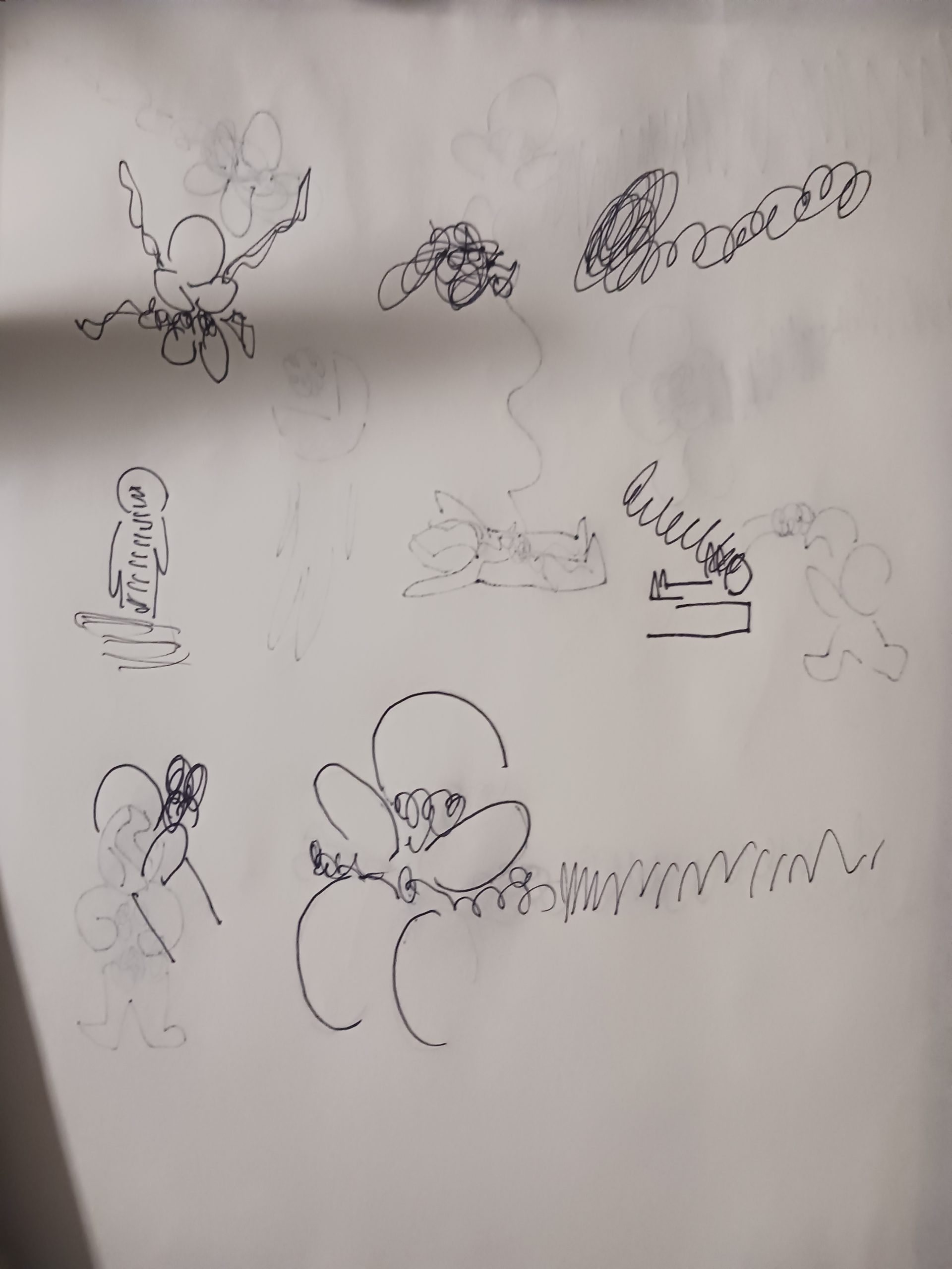
The next step from there was to take the images and ideas I got from reading the text and turn those into physical sketches
I explored this mainly through a visual of a person attached to a dark cloud that was consuming them, but that they held onto nonetheless.
I came up with the idea after doing some scribbling, which I thought accurately represented how my anxiety felt. I liked the idea of those scribbles consuming or holding someone back from their truest potential.
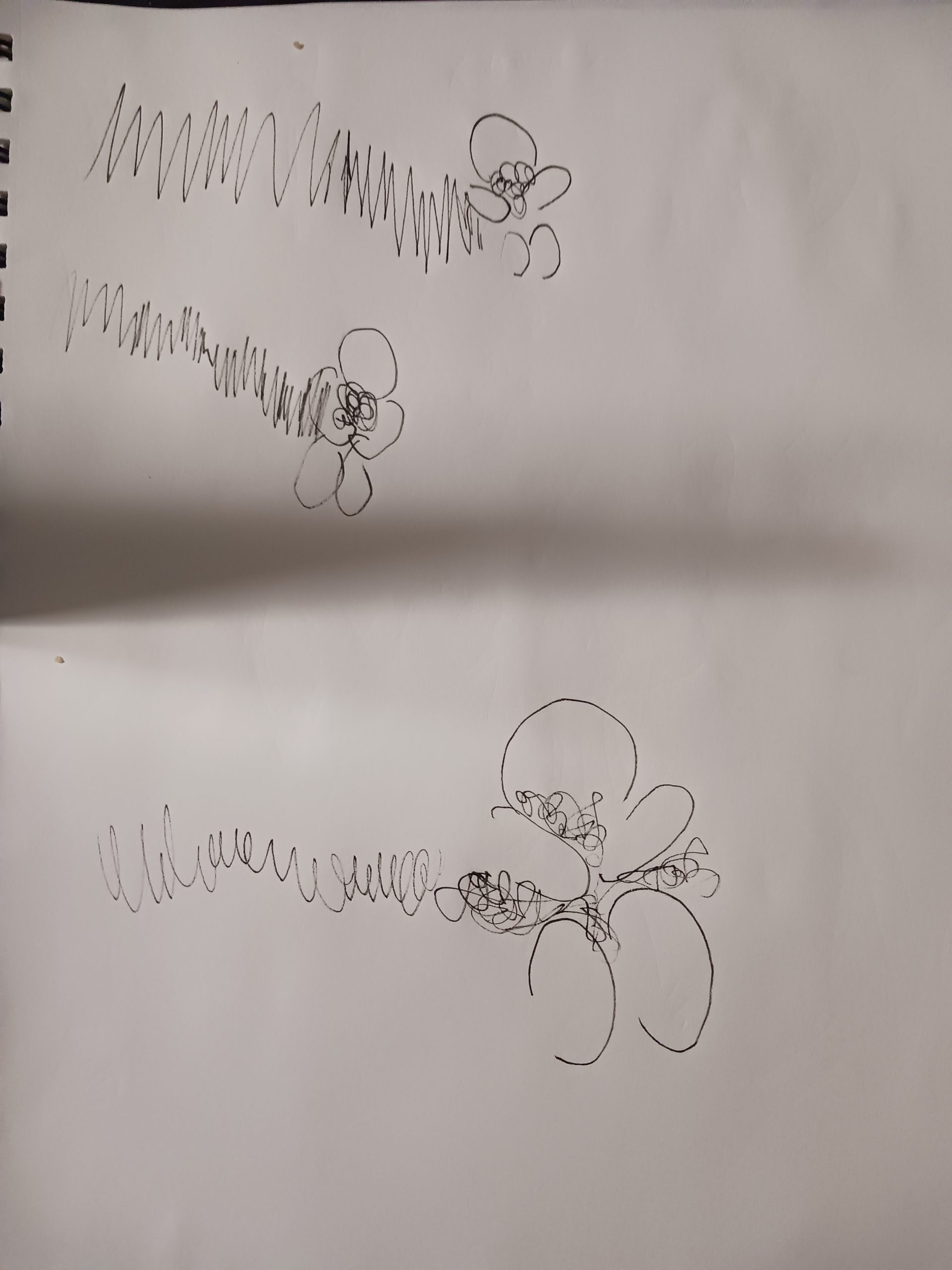
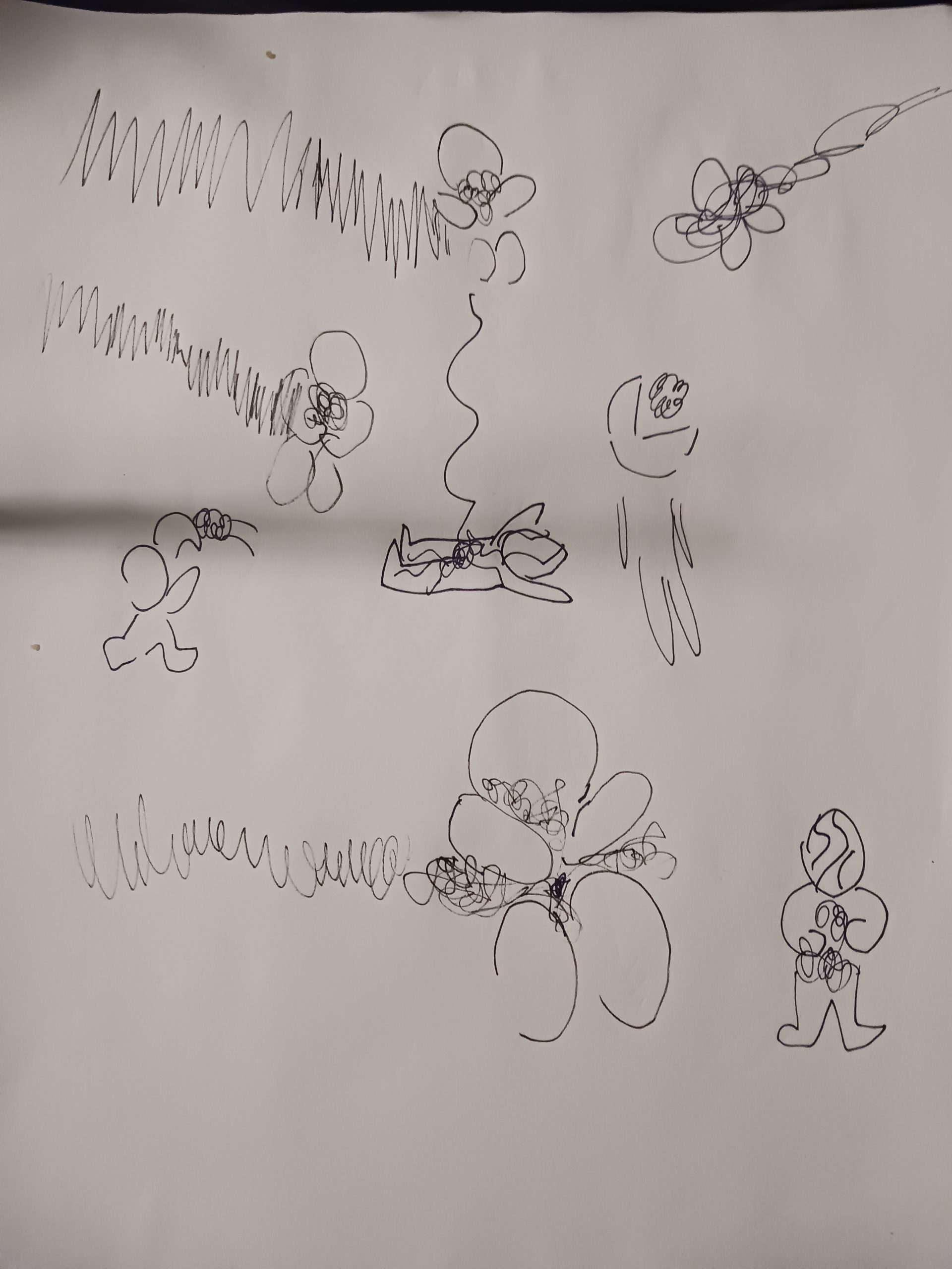
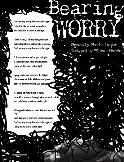
After doing some basic sketches of that idea, I tried to combine the images I had come up with with the text. You can see an early attempt at that on the right. I liked the aesthetic, but still needed to make sure the images revolved around and complimented the text.

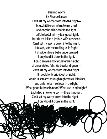


I had a number of variations on this idea, with increasing levels of complexity. Eventually the scribbles began to overtake the entire page; which I thought was good symbolism for the way anxiety consumes ones’ life.
This change largely occurred when I shifted my concept from being a two page spread to a one page spread.
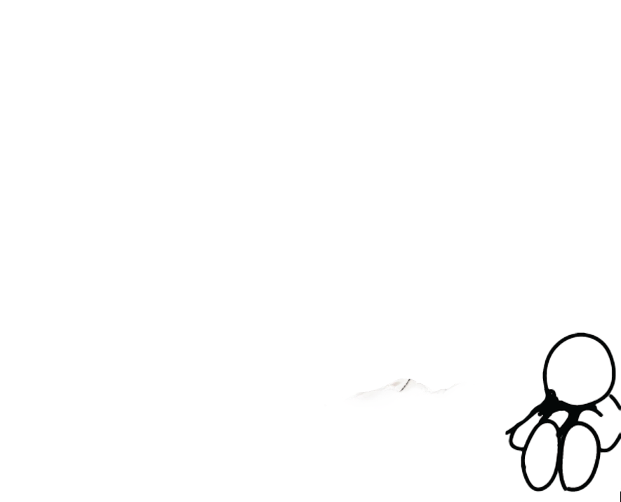
I also decided to contrast my sketch with a real life element; switching out my guy for a photo of a friend in a distressed pose.
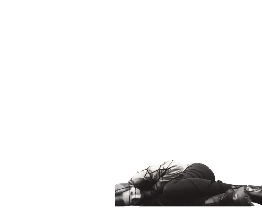
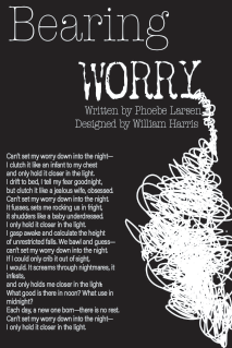
Combining all these ideas Looks Something Like This;


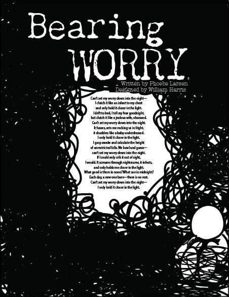
FINAL
from there it was pretty straightforward to finish the whole project…
Bringing all my seperate pieces and concepts together, this is what I ended up with!
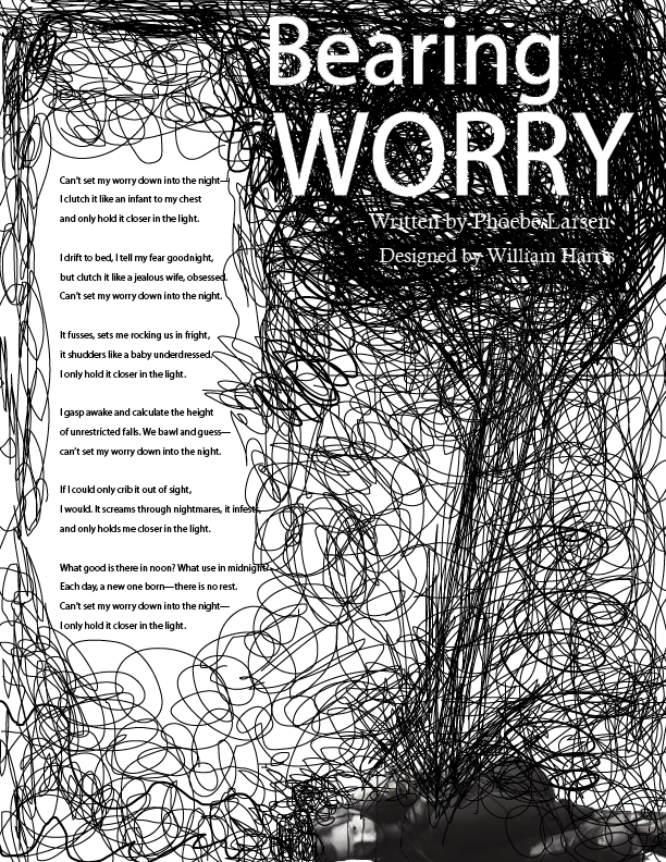
I ended up with this very striking image. It was put along side all the other concepts for this piece, and the class selected it to the published artwork in the magazine.
I’m very proud of my work on this piece, and think I visualized the concept in a striking, compelling way, that reflects the message of the poem.
CONCLUSION
This project really helped me learn how to trust the sketching and concepting process. My instinct is always to just jump to the project, but really sitting back and drafting these concepts are what made the final piece come so easily to me. It redefined the way I work on my design projects; I’ve adopted this format ever since.